
Once you have defined the structure of your website and the individual settings of the widgets, you can save the colour and design settings and upload your individual fonts.
In this article:
To open the settings, click on the edit icon in the top right hand corner  . An editing window will then open with the following tabs:
Colour and design settings (website theme)

The tab "Website theme" is divided into the 3 areas "Main colours", "Cards" and "Contrast theme", in which the following properties can be adjusted with HEX codes.
You can check your adjustments in real time in the preview on the right-hand side.
Main colours:
- The buttons are displayed in the primary colour.
- The secondary colour is only used for the headings of the individual widgets such as Schedule, Location, Registration, etc.
- The main background colour refers to the individual widgets - without boxes or set contrasts.
- In addition, you can store the colour of the main text, which refers to the body text.
Cards:
- The "Background around cards" refers to those widgets which display the contents in additional cards. These include, for example, the "Registration" and "Schedule" widgets (Layout 1 & 2).
- The colour scheme for the "Background inside cards" can also be defined individually.
- If you activate the toggle "Flat cards", the card is displayed without a border ("shadow"). The border makes the card stand out a little.
Contrast theme:
To apply the contrasts on the website, please activate the toggle first. In the area that now opens, you can make the following settings:
- With the help of the field "Contrast background colour" you can define the contrast for all those widgets in which the toggle "Contrast" has been activated. You can find more information in the respective widgets. By default, this applies in particular to the header (layout 2) and the footer.
- To ensure that the font of the respective widgets, for which the "Contrast background" has been applied, is well readable, you can define the corresponding colour in the field "Contrast text colour".
Lines and borders:
- You can use the slider under "Button border radius" to set how rounded the corners of your buttons should be displayed. If the slider is all the way to the left, the buttons are square; the further the slider is moved to the right, the more rounded the buttons are displayed.
- The slider under "Lines thickness" allows you to make the frame line of your button thicker.
Attention:
The "Lines thickness" setting also affects, for example, the separator line in the registration form or the lines of the schedule.
Define spacing (padding & margin) (website grid)
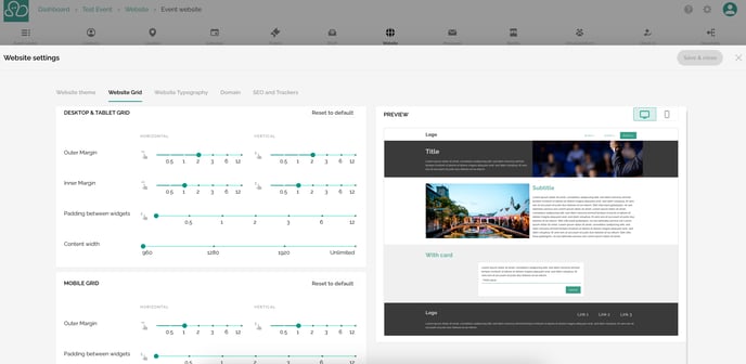
The tab "Website Grid" offers you the possibility to change the distances, for example, between or within the individual widgets. You can differentiate between horizontal and vertical alignment.
On the scale, you have values between 0 and 12 at your disposal. 0 suggests the smallest distance, while 12 represents the largest distance.
- Outer Margin: With these two buttons, you define under "Horizontal" how large the outer distance of the widgets, i.e. from the website edge to the widget, should be. Under "Vertical" you define the outer margin of the individual widgets upwards or downwards.
- Inner Margin: Use the slider under "Horizontal" to define the distance between the content (e.g. text, images or videos) on the left and right to the edge of the widget. With the help of the switch under "Vertical", you can adjust the distance within the blocks upwards and downwards.
- Padding between widgets: This slider gives you the option of setting how large the distance between the individual widgets on your website should be. Unlike the Outer Margin ("Vertical"), the spacing is not applied to the Navigation, Header or Footer elements.
For the "Smartphone Grid", the following setting options are available in the same way as for the desktop and tablet version:
- Outer Margin (horizontal & vertical)
- Padding between widgets
You would like to see how the spacing looks in the mobile version? Switch to the mobile view using the smartphone icons in the preview area on the far right.
For both the mobile and the desktop/tablet view, you can see directly in the preview how your adjustments affect the structure of your website.
You would like to undo your settings? Then click on the button "Reset to default".
Please note:
All adjustments apply to all widgets. It is currently not possible to make changes only for specific widgets.
Content width
In a further step, define the width of your website in the "Website Grid" tab. Three pixel sizes are available for this purpose:
- 960 px
- 1.280 px
- 1.920 px
Another option is not to limit the width of the website.
The width is predefined with 1.280 px by default.
Please note:
Even if you set the width of the content or your website to 1.280 px, for example, you can still display the content of the individual components over the full width. This is useful for the header, for example.
Deposit fonts (website typography)
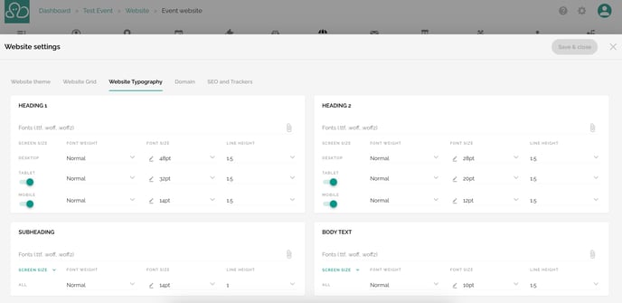
Use the "Website typography" tab to define the font weight, size and line height and upload your fonts.
Please note:
Your fonts can be uploaded to evenito in .ttf, .woff or .woff2 format using the file manager.
Attention!
For security reasons, some content can not be displayed in edit mode in the site builder. Externally embedded fonts might not be displayed correctly. All content can be accessed and used via the preview button and the published website.
- Heading 1 refers to the event name in the header widget.
- Heading 2 influences the headings of the individual widgets (e.g. "Free text", "Speakers", "Location" etc.).
- Heading 3 refers, for example, to the address of the location or the first and last names of the speakers.
- Body text refers to any text in the free text or description fields, such as the speaker titles and descriptions or the directions under "Location".
Please note:
When a participant opens the website, it tries to find the font that is available for them in the browser they are using. The order is usually:
- (if stored) your custom font
- Raleway
- Roboto
- Helvetica Neue
- sans-serif
Please note:
In each description field in evenito backoffice and also on the event website, you can, for example, display your headlines to match your here stored settings. The font size dropdown shows you exactly which size corresponds to which headline from these settings.
For the font weight, you can choose between thin, normal, bold and extra-bold in the dropdown for your headlines (1-3) and the body text.
You can also define the font size via the dropdown. The unit is pt, i.e. point font. You can also use the pencil icon to set the font size manually.
You can use the line height to define the distance between the individual lines. You can also define this distance using the dropdown.
Please note:
The size for the desktop view can also be used for all other end devices, i.e. tablet and smartphone. If you do not want to make any individual adjustments, deactivate the switches under "Tablet" and "Mobile".
If you would like to individualise the tablet view in addition to the desktop view, for example, first click on the dropdown "Screen size" and then activate the switch under "Tablet". Now define the details listed above. These settings for the "Tablet" view are now also applied to the mobile view. The switch for the mobile view remains deactivated.
You only want to customise the desktop and mobile view, but not the tablet view? Then activate the toggle under "Mobile" and deactivate the toggle under "Tablet". In this way, the settings for the desktop view are adopted for the tablet view and the individually stored information for the mobile view.
Next step: Create website structure