
The "About" widget allows you to insert an individual text and a picture of your choice. It is up to you whether you use this, for example, for the initial description of your event or for additional explanations and images of your location.
To insert the "About" widget into your structure, drag and drop it from the left column into the column on the right. Then move the cursor over this newly inserted widget and click on the edit pencil.
Attention!
If you have set up a multilingual event website, please note that the language display from the "Navigation" widget does not correspond with the general language switcher of the tool. Therefore, when editing the widget, make sure that you store all desired content in the correct languages. Use the language assistant with this icon  to help you and check via the language switcher in the upper right corner whether you have set up the content in all languages. You can find more detailed information this in this article.
The following settings can now be stored:

- By selecting the"Layout", you determine how the widget will be displayed on your website.
- If you activate the checkbox "Override background theme", you can individually adapt the background colour defined by default in the website settings for this widget. The best way to do this is to define the colour of the widget using the HEX code. The HEX code is not available to you? Then click in the field and enter the HSL values in the pop-up window.
- If you do not activate the "Overwrite background theme" check box, you have the option of selecting the "Contrast Theme" check box instead. The widget now adopts the colour value defined in the website settings by default.
- Full width: set whether the widget takes up the entire width of the website or whether it adapts to the content. We show you how to define the content width in this article.
- The Heading defines the name of this widget and thus the title that the participants see above this section. You can name the heading as you wish.
- You decide whether the text is displayed to the left or right of the image by the "Alignment".
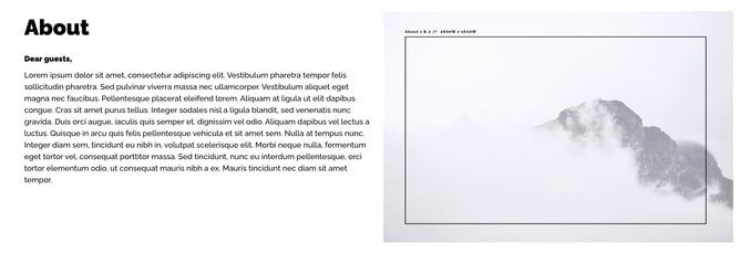
- In the Image section, you have the option of clicking on the pencil to be redirected to the file manager in order to insert an image. If you want to delete the image, simply click on the trash can icon. Please also pay attention to the recommended image sizes.
- In the Content field you can insert and format your desired text.
You have the option of displaying your text in bold or italics, for example, or to use the bullet points, to add files or links or to determine the size of the font. - Under "Button label" you can enter the name of a button and store a "URL" for a link/redirection. Activating the "New Tab" switch opens the linked website in a new tab. If the switch is deactivated, it opens in the same tab.
Attention!
For security reasons, some content can not be displayed in edit mode in the site builder. For example, externally embedded images are displayed as broken images and externally embedded fonts might not be displayed correctly.
All content can be accessed and used via the preview button and the published website.
Save your adjustments by clicking the "Close" button.