
In this article:
The most common setting options
Clicking on the pencil to edit the widgets gives you various setting options depending on the widget. We have listed the most common setting options here.
- In the "Layout" dropdown, you have the option of choosing between different display options for the widget.
- Image/Logo: click on the edit pencil to be redirected to the file manager where you can insert an image. If you want to delete the image, simply click on the trash can icon.
Please note:
We recommend to use an .svg format. You can find more information on the recommended image sizes in this article. If you don't want to display an image in your header, simply leave the field empty.
- If you activate the "Overwrite background theme" toggle, you can customise the background colour defined by default in the website settings for this widget. The best way to do this is to define the colour of the widget using the HEX code. Don't have the HEX code available? Then click in the field and enter the HSL values in the pop-up window.
- If you do not activate the "Overwrite background theme" toggle, you have the option of selecting the "Contrast theme" toggle instead. The widget now adopts the colour value defined in the website settings by default.
- Full width: set whether the widget takes up the entire width of the website or adapts to the content. We show you how to define the content width in this article.
Please note:
We recommend that you set the full width by activating the toggle.
- Use the alingment icons to define whether your image content should be displayed on the left-hand side or on the right-hand side.
- The Heading defines the name of a widget and therefore the title that participants see above this section. You can freely name the heading.
- You can insert and format your desired text in the Content field.
Further settings for the widgets:
There are also additional, specific settings for individual widgets.
Navigation

- If you want an external website to be opened when the logo is clicked, you can enter the corresponding website URL under Logo link. If this line remains empty, no action will take place when the logo is clicked.
- In addition to the individual content-related navigation points, you can also move the language switcher to a different position for multilingual events. The languages are displayed to the participants as abbreviations (e.g. DE, EN or FR). To do this, hover over the language switcher so that the symbol for moving it
 appears on the right-hand side: Select it and drag and drop the language switcher to the desired position.
Please note:
Each language on your website is treated as a separate "website", which leads to new paths (e.g. https://test.de/en or https://test.de/de).
If a participant would change the language, e.g. from German to English, while entering the data in the registration form, the data already entered would be lost as it is a different path.
- Elements of the navigation: define the necessary navigation points in the lower area. You can define the following for each navigation point:
-
- Description of navigation points (left side): Enter your navigation points here and define the respective description.
- URL (right hand side): you can either enter a link (e.g. to another website template or an external page or document) or refer to the individual widgets on your website. For the latter, proceed as described below:
 (centre): In order to link to the existing widgets in your website structure, you have the option of setting an anchor for each widget, e.g. for registration, the schedule or the speakers. If your participants then click on the button in the navigation, they will automatically jump to the corresponding widget on the website. To add an anchor, click on the hashtag symbol in the middle. A list opens with all the widgets that you have already added to your website. Select the desired widget. The field under "URL" is now automatically filled with the corresponding code. Proceed in this way with other menu items as desired.
- If the toggle for the individual navigation points is activated, these are displayed as buttons in the navigation. The buttons are displayed in the primary colour defined by you in the website settings.
Header
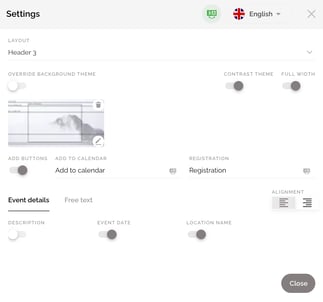
- You can also add Buttons to your header such as "Add to calendar" (download a calendar entry) and "Registration" (takes the participant directly to the registration form) by activating the "Add buttons" button. You can adapt and overwrite the labelling individually.
Please note:
The buttons can only be activated or deactivated together. It is not possible to use the buttons individually.
- Under "Event details" you have the option to determine which event information should be displayed in the header. Activate the toggle below the caption.
The following information can be displayed:
Description: You have stored this text in the Basic Setup in the Event Centre.
Event Date: The event date you entered in the Basic Setup is used.
Location Name: The Main Location you defined is displayed by name. - If you would like to define the information displayed on the header yourself, simply select the "Free text" tab. The "Free text" allows you to define the title and the description yourself. Please note that you can also vary between different text sizes. To do this, choose between small, normal, large and huge in the dropdown menu.
Schedule

- If the “Group Specific Schedule” switch is activated, participants are only shown the schedule items assigned to their group on the website. To do this, assign the individual schedule items to the corresponding group(s) in the “Schedule” widget.
Speakers

- By activating or deactivating the switches next to the speaker names, you can decide which of your speakers stored in the Speakers tab should be displayed on the website.
Location

- Under Map Provider you can decide whether you want to display a Google Map or an OpenStreet Map. If you decide to use the Open Street Map, you can choose from the different map layouts that we have listed in this section of the article.
Please note:
Google Maps adds cookies to the website and it will be deprecated soon.
-
OpenStreet Map layouts
If you decide to use the map provider OpenStreet Map, you can choose between the following layout options under the dropdown menu "OpenStreet Map Style" to display the map and thus adapt it to the design of your entire website:
- Light: Standard map
- Dark: Dark map
- White: White map
- Black: Black map
- Grayscale: Grey map
- By default, the main location you declared is displayed. If you have entered more than one location in the event, you can select and add the desired one via the "Location" dropdown.
Please note:
The tool allows you to add as many location widgets as you like to your website and, for example, to list all your defined locations.
Custom content

- In the Embedding code field, you can store your corresponding custom code as an iFrame or JavaScript.
Please note:
Custom content is not displayed in the preview.
Publish the website to view the content.
Important Note:
This widget can only be used by users with the role "Administrator"! If the widget is stored in the website structure, it can also be edited by users with the "Event Manager" role.
After activating this widget, you are completely free to place any content on your website using a custom script. However, it is important to note that your custom code interacts with the existing website code and may even overwrite it. Since evenito can no longer influence the behaviour when using a custom script, evenito does not offer any support for this website.
About + Highlights

- Under "Button label" you can enter the name of a button and store a "URL" for a link/redirection. Activating the "New Tab" toggle opens the linked website in a new tab. If the switch is deactivated, it opens in the same tab.
Icons

- Items: Here you have the option of adding up to 6 pictures. Click on the edit pencil to be redirected to the file manager where you can insert your pictures. If you want to delete a picture, simply click on the trash can icon. Pay attention to the recommended image sizes.
- There will always be 2 icons displayed next to each other. Additionally you have the possibility to add a subtitle and a description text per icon.
- In the description field you can insert and format your desired text. You have the possibility to display your text in bold or italic, to use the bullets, to add files or links or to determine the size of the font.
Please note:
The icons are currently only left aligned and there is no possibility to center them.
Photo

- By selecting the layout, you determine how the widget is displayed on your website.
- Layout 1: up to 4 thumbnails (landscape mode)
-
- Layout 2: up to 6 thumbnails (portrait mode)
Please note:
On the mobile website version, in layout 1 only your first two thumbnails are displayed - and in layout 2 the first three of your selected thumbnails!
- By activating or deactivating the buttons next to the albums, you can decide which of your stored photo albums are to be displayed in this widget.
Video

- Use the slider to define the relation between video and text. If you move the slider to the left, the text becomes larger while the video becomes smaller. If you move it to the right, the video becomes larger and the text column narrower. The text size is retained as stored in the settings. This feature is only available for the "Video 2" and "Video 3" layout.
- Embed code: We recommend embedding your video using a code (iFrame or Javascript). These instructions show you how this works, for example, with a YouTube video. Afterwards, no further adjustments are necessary in the fields ‘Embed a URL’ or ‘Embed your permissions’.
Alternatively, you also have the option of inserting your video via a URL.
Please note:
If you try to add a URL for which the video source has not yet been added to the resources, you will receive an error message. Please first add the corresponding source in the space settings or have a user with the role Administrator store it there.
- Embed your permissions (e.g. audio play, loop, switching off the sharing function or controls).
Booths

- Use the drop down menu under "Type" to select the booth type from which you want to map the booths in this widget.
Please note:
If you want to display booths of different types, you can drag the "Booths" widget into your website structure again and select a different booth type with correspondingly different booths.
- By activating or deactivating the buttons next to the booth names, you can decide which of your individual booths of this booth type should be displayed on the event website.
Footer

- Links to Social Media: Use the dropdown on the left to add the desired icons. In the next step, you can add the link on the right hand side. The following Social Media platforms are available:
- Kununu
- TikTok
- Snapchat
- Youtube
- Vimeo
- Spotify
- Yammer
- Website
Please note:
In layout 4 of the footer no Social Media links can be stored.
- In the "Footer links" section, you can add further links that should be displayed in the footer in addition to the Social Media icons (e.g. imprint, data protection, contact). First enter the title and in the second step the desired URL to which you want to redirect.
- The "Copyright text" field allows you to add further texts/descriptions. You have the option of displaying your text in bold or italics, using the bullet points, adding files or links or determining the size of the font.
Please note:
In layout 3 of the footer no additional copyright text can be displayed.